What we do to make Easy LMS accessible
Accessibility and user-friendliness is usually a rare topic of conversation when it comes to software. At Easy LMS it’s not. It is one of our main priorities.

You and your friends all have tickets to your favorite artist’s concert. You’ve been talking about it for weeks, and tonight is finally the night. At the entrance, your tickets are scanned. Except … your ticket is invalid. You try to convince the guard to let you through, but he doesn’t give in. Everyone is allowed in except you.
After the concert, you meet up with your friends. They are all talking about how awesome the concert was! They were in the front row the whole time. Afterwards, they even got autographs and were able to take a photo with the artist. They show you videos and photos of the concert. The concert you missed, because you weren’t allowed in.
This hurts, doesn’t it? You were excluded because you simply had bad luck.
We strive to make our platform as inclusive as possible.
At Easy LMS, we don’t want to exclude people just because of bad luck. We think it’s important that everyone can use our product, regardless of their background, location, circumstance, or condition. We strive to make our platform as inclusive as possible. Here’s what we did to make that happen.
What is accessibility?
More than one billion people worldwide have some form of disability. There’s a wide range of disabilities, falling into the following categories:
- Visual impairments, such as loss of sight or blindness. The World Health Organization estimates that 217 million people are visually impaired and 36 million people are blind worldwide.
- Hearing impairments, such as low levels of hearing or no hearing at all.
- Mobility impairments, such as loss of limbs, paralysis, or difficulty controlling limbs.
- Cognitive impairments, which can vary widely. This category includes people with mental illness, learning disabilities (such as dyslexia), and intellectual disabilities.
We can roughly divide these disabilities into three modes: permanent, temporary, and conditional/situational. Not all disabilities are permanent. Consider how you would struggle to use a computer if you broke your arm. Or, how direct sunlight on your smartphone makes it difficult to see what’s on the screen. Our view on accessibility involves all of that. We want you to be able to use Easy LMS whoever and wherever you are.
Our road to an accessible product
Making Easy LMS accessible is an ongoing process.
To make Easy LMS accessible and user-friendly, we have carefully audited our pages. This took many iterations - and sometimes it was a bumpy ride. It doesn’t end there, though. Making Easy LMS accessible is an ongoing process. Our new features receive the same amount of attention when it comes to accessibility. And we still want to make the current platform even more accessible than it is now! Now, let’s talk about a few things we have already done for accessibility.
Color contrast
In 2019, we introduced a new and improved color theme. We liked the original colors, but the contrast was bad. We carefully designed a new color palette, which was compliant to the WCAG 2.1 guidelines (level AA). First, we designed a few different versions. Then, we asked our client base which one they liked best. After we implemented the new theme, we grew fond of it quickly. It’s much easier on the eye. You’re looking at the result right now! However, it’s still a bummer that our orange Dutch design didn’t make the cut 😉.


Keyboard navigation
What a sharp knife is to cooks, a keyboard is to blind users behind a computer. They can’t go anywhere without it. They use the keyboard to control their screen reader. In addition, many users with motor disabilities rely on a keyboard.
Some people have tremors or can’t use their hands. Some people don’t have hands at all. Many of these people use alternative input devices to surf the web, such as speech input, a head pointer, or a mouth stick. These devices mimic keyboard behavior or work together with a keyboard.
At Easy LMS, we paid close attention to the keyboard navigation throughout the website. Our main changes include:
1. Providing a logical tab order
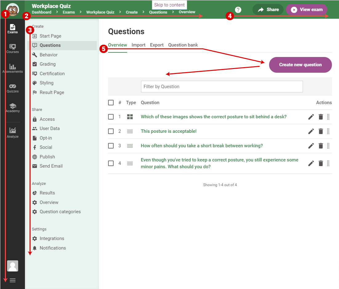
Moving through our platform with a keyboard follows a logical order. In our dashboard, the menus are spread out on the left side and the top of the screen. When tabbing through, users will go to deeper and deeper levels. We make sure the context menu (where you can share and view your exam) is semantically inside the exam and not above it.
We know there’s a lot of navigation happening in our dashboard. To provide the user the option to skip past this, we implemented a skip link. This means you can jump to the content section from the top of the page at all times. It’s kind of a secret escape 😉.

2. Setting focus styles
Flying blind on a web page. It happens when you don’t have clear focus styles. To show the user where they’re at on the page, we added focus styling to all “focus-able” elements on the page. Focus-able elements are all interactive elements, like buttons, links, and form inputs. Through a script, we detect which input type is being used. This way, we can add additional styling for users who use a keyboard. Meanwhile, we keep it clean for the mouse users.
3. Pressing buttons with a keyboard
A general rule of thumb is: if it’s a button, it should look like a button and behave like a button and vice versa. When a user “clicks” a button with a keyboard, they expect it to work the same as it would with a mouse. The same goes for links, of course. Most of our scripts are compatible with keyboards. In the rare case they aren’t, we provide a proper alternative for our keyboard users. For our dashboard, we use Foundation by Zurb as our front-end framework, which provides full accessibility support.
Screen reader support
 For screen readers, we had to take it one step further. Our platform is full of visual cues and icons. These aren’t visible for users with a screen reader. We added hidden labels and texts throughout our entire platform. We did this with so called ARIA-attributes and off-screen text. We communicate states and alerts to the screen reader.
Has my question been saved? Which page in the navigation am I currently on? Has the drop-down menu I just tried to open been expanded? We provide our screen reader users with as much feedback as we can.
We have become real experts on screen readers because we test thoroughly with different types. We teach our own developers how screen readers work and how one can test with them. Finally, our tester, Caroline, will go through the pages with a screen reader once more in the test phase. We don’t like to leave these things up to chance.
Zoom support
Last, but not least, we provide support for users that zoom the page. This is for people who have low vision and want to magnify the page to make it easier to see and read. We provide support for this. For instance, we make sure our main navigation doesn’t fall off the screen and remains scrollable when enlarged.
The future of accessibility at Easy LMS
We are planning a lot of cool stuff to ensure the accessibility of Easy LMS.
It's not done until it’s done. That applies to our work in the area of accessibility as well. We can always make it better and smarter than before. We are planning a lot of cool stuff to ensure the accessibility of Easy LMS. We are currently working on automating the tests of our code. Furthermore, we are setting up internal guidelines to make sure our current level of accessibility stays in place. We’ve made some great steps in the area of accessibility, and we keep learning every day.
Our ultimate goal is to be available to everyone. We think it’s important that everyone gets to use our product. Small steps like these can make a big difference to our users. We’re glad to be a part of that.
